Get live data, process it, create a beautiful dashboard, all with Microsoft Power BI and RStudio.
The Tour de France is heating up! Dimension Data built and designed a comprehensive digital infrastructure to allow fans unprecedented access to real time data. Every bike contains a suite of sensors. These sensors transmit data to relay stations in support vehicles and nearby aircraft which finally forward the data to the Command Hub (A big truck parked at the finish line).
A great interface is available at http://livetracking.letour.fr, but I wanted to see what I could do in Microsoft Power BI. It seemed like a great chance to delve into the R custom visuals and spatial/mapping preview features.
The first task is to determine how to access data. Dimension data offers many endpoints that respond with JSON data. Here is an overview of the data available.
Host: http://fep-api.dimensiondata.com
| Endpoint | Data Available |
| /v2/stages/{stage_id}/rider-telemetry | Location data for each rider on the course. Also some high level averages and stage progression. |
| /v2/race/19/stages | Data available for each stage of the Tour de France race. Includes start/end town and Stage length(km) |
| /v2/race/19/stages/current | Returns dataset for the current stage. |
| /v2/map/route/{stage_id}/2?lang=en | Gives data on the stage including: points of interest, GPS and altitude data. |
| /v2/stages/{stage_id}/weather?DistanceFromStart=x | Gives data on the weather at specified point along the course |
There were further endpoints available offering, even more data: jersey wearers, groups within the race, rider profiles, and other data. I opted to keep it simple and include only the data that I’d like to work with.
Acquire Tools
Download PowerBi Desktop: https://powerbi.microsoft.com/en-us/desktop/
Download RStudio Desktop: https://www.rstudio.com/products/rstudio/
Open Microsoft Power Bi
PowerBi is a tool for visualising and reporting on data. It contains data modeling functions and loads of visualisation options.
Let’s open Power BI and load our first data: the stage data.
Loading Stage Data
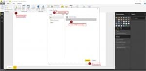
Start by clicking the Get Data button. Search for and then select the “Web” connection.
Add the data source endpoint: http://fep-api.dimensiondata.com/v2/race/19/stages
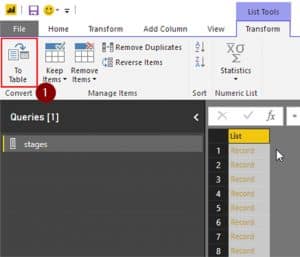
Each stage will be returned from the server as a record. This will need to be converted to a table and expanded so that Microsoft Power BI can work with it.
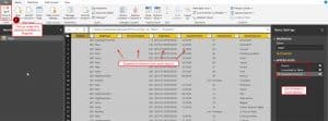
See the button in the top right to convert the dataset to the table. Click OK in the dialogue box the pops up. We do not need to specify delimiters in this case.
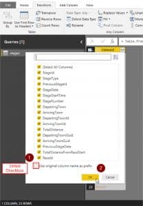
Although it looks the same, the internal representation of our data has changed. We have processed the data into table form. We are now ready to expand each record. Click the icon at the top of the column of data to expand each record into several columns.
The column selection panel will appear. This allows us to specify what columns each record will be expanded into. Untick the ‘Use original name as Prefix’ as we don’t need this. Expand all the columns.
On the right, we can review the list of steps required to build this dataset. We can apply further steps as required. Once completed we can click the button in the upper left to process the data as specified and make it available to the Report.
We have now completed the addition of the stages dataset to the report. We can follow the exact same process for the ‘current stage’ dataset
Getting Rider-Telemetry and Current Stage Profile
As the rider-telemetry and current stage profile datasets depend on the current stage, we need to determine the current stage identification number and then tailor our request to the API so that it includes the current stage.
First, we will load the rider telemetry with a place holder stage identifier. This will later be replaced by the current stage identifier. After replacement this dataset will return the current live rider positions, speed, position, and more.
URL: http://fep-api.dimensiondata.com/v2/stages/205/rider-telemetry
Drill-into the list, convert it to a table and expand the records to generate the table of data about each rider. To convert to a table utilize the button in the top-left.
Expanding the records is exactly the same as for the previous expansion of stage data.
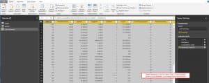
Your resulting table should look like the following
Here we see one row per rider and have lots of relevant data points.
Substitution of Current Stage Identifier
We will copy the current stage data set and extract just the StageID value. Once we have this value we will insert it into the request for rider-telemetry. This technique can also be used to get the current stage profile data.
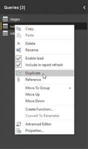
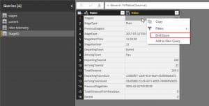
This is completed in the Query editor area of PowerBI. First, duplicate the current stage dataset. Right click on the stage and select ‘Duplicate’
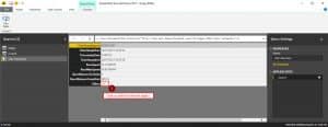
Rename the new dataset to ‘StageID’ or some other relevant identifier. After selecting the renamed dataset right click the StageID value and select ‘Drill Down’. This focuses the dataset down to a single value, which is exactly what we want to substitute into the other live connections.
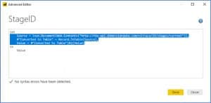
Now we need to copy the code which we have constructed to generate the StageID value. We will insert this into the rider telemetry query. This means that when ever our report loads rider-telemetry it will first need to request the current stage. After it has the current stage it can accurately request rider-telemetry. We can also use the same logic to request the currently active stage profile and route.
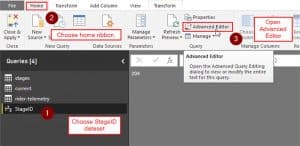
To view the PowerQuery code we have generated we will use the Advanced Editor screen in Microsoft Power BI
Copy the code which requests and extracts the StageID that we are interested in. Close the window.
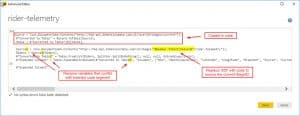
Open the Advanced Editor with the rider-telemtry dataset selected. Add in the code copied from the other data set at the top (after the opening let statement). Your result should look something like the following. In the first segment of code we request the current StageID. This value is then inserted into the URL for the rider-telemetry request. We had to rename several of the steps below as they conflicted with the upper segment.
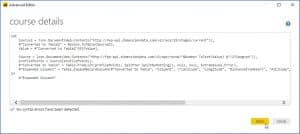
Now our rider-telemetry dataset is reflecting the current stage. Great! We can do the same process for stage profile. Here is the code I used for course detail
Building Visualizations
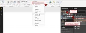
Before we can build some visualisations we need to configure the metadata so that PowerBI can understand how to work with the data we have provided.
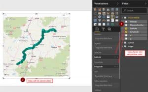
Let’s set the Latitude and Longitude meta data correctly. We then insert a map visually and add the data fields to the visualisation input fields.
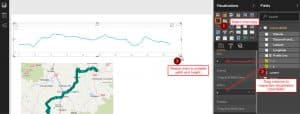
Map visual should look similar to the following
Addition of Profile for Current Route
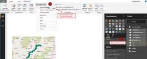
To complete this task we need to tell PowerBI to interpret the values in ‘x’ and ‘y’ data columns as numbers. This can be done with the ribbon
Once the values are interpreted as numbers we will see the sigma symbol appear next to the column name. We can now construct a Line chart with these values to see the profile of the current track.
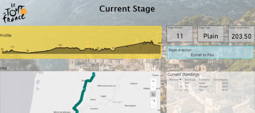
This profile matches what is provided by the live-tracking website(they have additionally added the points of interest) Excellent!
Additional Formatting and Layout Options
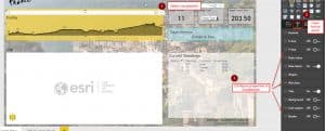
PowerBI offers a host of format and layout options. These can be adjusted in the format control area on the right. In the example report, I’ve created an orange rectangle to form a background for the profile. I’ve adjusted the label frequency settings under the Data labels area. This enables the labels of altitudes throughout the profile chart.
The page itself can have formatting options adjust in the same way. I’ve set this background image to brighten up the report. I’m also making use of the Preview feature or Esri maps to plot the route.
It is easy to import images and use them to smarten up the report.
R Custom Visuals
It seemed that the profile visualization should be able to show the rider positions in the current stage. I created another dataset combining rider positions and route data. This gives a unified dataset to pass to the R custom visuals.
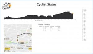
R visuals allow a higher level of customization. In this case, I have used them to plot rider location indicators on top of the profile line. I’ve also used the rider telemetry data to plot the riders positions on the map to get an idea of distance between them.
These visualizations are available on the second sheet.
If you have any questions about our live data or how to create a dashboard using Microsoft Power BI to accelerate your business. You can call us on Australia: 1300 490 795 New Zealand: 0800 111 728 or email hello@walkerscott.co
Links
RStudio: RStudio
PowerBI Custom Visuals Gallery: Office Store PowerBI Gallery

